It's a bit of a stretch, I know, but I don't give a damn :P
Editing steps.
Saturation
contrast
curves
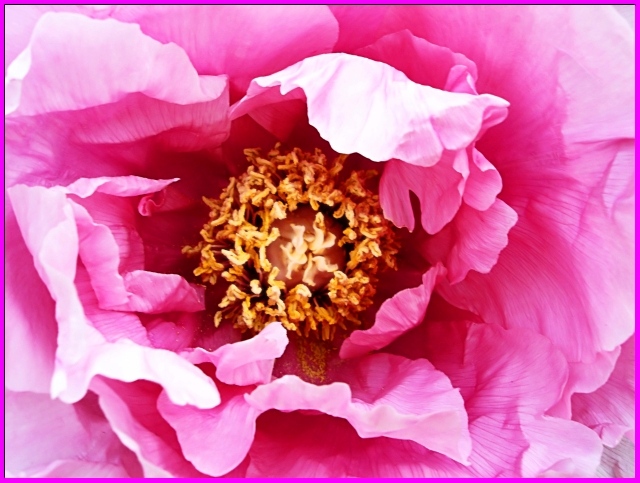
adjusted the brightness of the flower center using elliptical selection
used the softglow effect
Neat Image
unsharp masking
All editing done in gimp as usual.
I'm not very satisfied with this one, something seems off about it, I can't put my finger on what exactly. I think it's the image quality thats bothering, as this was taken with an inferior camera, the outer petals seem too... digital.
Statistics
Place: 195 out of 222 Avg (all users): 4.7059 Avg (commenters): 4.2500 Avg (participants): 4.5469 Avg (non-participants): 4.7786 Views since voting: 730 Views during voting: 274 Votes: 204 Comments: 8 Favorites: 0
You say you were unsatisfied with this one; it seems your instincts were correct, as you scored well below the challenge average.
Pros:
The pinks are nice; I personally like the up-close frame-filling composition.
Cons:
For me there are several:
There are significant blowouts on the petals, which always detracts. My camera will warn me when I have blown-out areas - I find it helps a lot with getting exposure right.
The stamen/pistil cluster has a kind of weird, electric feel to it that is distracting for me; I think it's perhaps just oversaturated.
Having complimented the frame-filling above, I would say that I think it would work better with the flower either less centered or more centered; I'd also have tried a square crop as the aspect ratio does nothing to help to image.
Challenge:
You acknowledge it's a bit of a shoehorn; I think many images in this challenge were so it didn't hurt as much as sometimes, but means you needed a compelling image to overcome it.
Overall I think it ended up scoring a little lower than it deserved, perhaps because of the loose connection to the challenge; however I think some more attention to technicals could have helped significantly. In general an image that is just "pretty" isn't going to grab me a lot unless the technicals are spot on.
Good perspective from the top and I like how you filled the frame. There are areas which are blown out, so maybe the light from above should be diffused.





 Add photograph to your favorites
 Add photographer to your favorites

 Photographer found comment helpful.


