Initial thoughts/My opinion Great funny submission, technically well made, should have done better. Has some compositional issues.
Content/Composition The general concept in combination it well thought of. Of course some voters might have had problems in seeing the motivation, but to me that is not an issue.
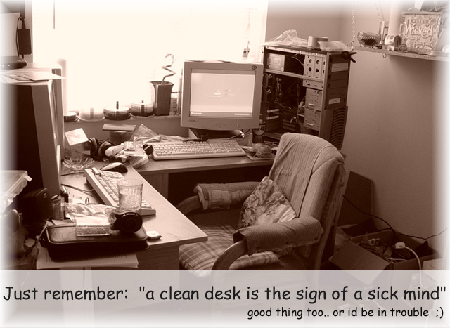
To me the image is actually too clean: the main focal point, the chair and the PC in the back, are too clean and very inviting. Only the left desk looks a little messy, but still not too strong. And that's my main issue: intention and image do not fit as well as they probably could. Also the overexposed window brings too much order in the image.
The soft light and the warm colour choice make it very cosy, even for people (not me :)) who like a tidy desk.
So turning the camera more to the messy parts might have been a better choice.
I do like the way the light is set though: as mentioned, the softness is great and that the window is overexposed is something I like as an compositional element too.
Camera work -technically Looks good to me: everything is sharp and exposure is good too.
Digital Processing - Technical Again good work here: especially I like how you brightened up the lower portion for the text. In principle I do like that for the border too, but where the bright areas of the border overlap with the one for the text there is a sharp boundary which is not so good.
I like the font you selected.
Fits the challenge Yes it does (see above). I only would have skipped the second line: it's not necessary to get the message through.
I was always told "A Clean Desk Means You have to Much Free Time" :)
Nice work. Very good lighting and contrast. I think you could have chosen a better font. But that is not important.
haha....my old IBM didn't have a cover either! My son dropped it when he was helping me move, and it wouldn't work with the cover on....I was happy it just worked at all! Nice poster and my desk is a mess too!
Oh, ooo, I am in trouble. My desk is pretty clean. I must be a raving lunatic... :-))
Love the sepia tone of this image. I think it simplifies it, otherwise this would look snapshottish. But it is good shot for the point you are trying to make. I also like the way you white out bottom portions of the image to make room for the text. Well done.






 Add photograph to your favorites
 Add photographer to your favorites

 Photographer found comment helpful.


