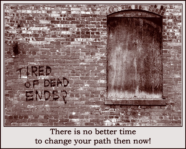
Found this painted on an old building in the Old Town district of Lansing MI. Converted to greyscale using channel mixer. Set different levels for wall, window, window sill, changed curve on window (4 layers all masked). Set brightness/contrast, resized, made a border. Duotone is made up of Pantone 449 cvc,Pantone 695 cvc each with individual curves. It's as straight as I can make it. It's a perspective problem!
Statistics
Place: 36 out of 94 Avg (all users): 5.9718 Avg (commenters): 6.1333 Avg (participants): 5.6515 Avg (non-participants): 6.1622 Views since voting: 1662 Votes: 177 Comments: 16 Favorites: 0
Excellent choice of monotone to emphasise the message. Cropping is just right. I think that I'd try the text in a smaller font to direct the eye to the image, then let it naturally move to the message below.
Beautiful photograph, but the fonts is kind of distorted and fuzzy. Also you could have given the text more space around it to separate the image from the text. Posters usually don't have borders on the edges. The middle border would have been enough. But the photo itself is great!
I glad to se some people using "non-pretty" pictures; this is appropriately "gritty" for your topic. For some reason the inner, light border by the brick bothers me a little, maybe because it almost but doesn't quite mimic the mortar lines. I'd like to see this with the inner black border touching the bricks.
Also, you have a typo or syntax error -- the next-to--last word should be "than" (but I don't deduct for typos!).






 Add photograph to your favorites
 Add photographer to your favorites


 Photographer found comment helpful.


