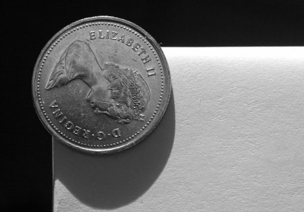
3 - 10's and 3 - 1's..interesting! I knew the shadow wouldn't go over well, but it was natural because of the round edge that wrapping the paper over the shelf created...I tried a few times to get rid of it, oh well. :-)
To be honest, the image does not give me an edge-felling. My first thoughts were: a coin on a white paper that is palced on a black paper.
A different angle, maybe from below might have been better. I do like the texture in the white part: makes the image more 3D.
someone else with a canadian coin...i like it :) the shadow is a little odd...harsh or something. i newer nickle would have been easier to light...less funny shadows etc. nice pic. Pedro






 Add photograph to your favorites
 Add photographer to your favorites


 Photographer found comment helpful.


