My other idea was a photo of a vacuum cleaner, with the title "Just because you suck, it doesn't mean you're useless" but I thought that would make people feel bad, not motivate them :P
Statistics
Place: 7 out of 94 Avg (all users): 7.0643 Avg (commenters): 8.2500 Avg (participants): 6.8095 Avg (non-participants): 7.2130 Views since voting: 9131 Votes: 171 Comments: 32 Favorites: 13 (view)
Seen this a lot of times actually, but never commented on it. This is a perfect concept and you executed it great. good to see there was digital quality a couple of years ago :P (j/k)
someone might have said this (don't feel like reading other's comments..) but i think the text should have been centered. i like this, because it's not a sunset.
you're amazing, by the way.
Hi Konador,
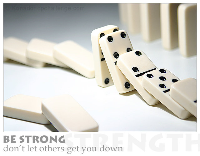
The left lower quarter of the photo is quiet hot. It's not your exposure but your lighting. Possibly to strong, or you caught a reflection (bounce) off of the white in the seen. This caused you to lose detail on the edges of the domino's at the bottom. It also caused the same effect on the one domino right behind the last one standing. It looks like reflection (bounce) to me. Changing your angle to the light or using cheese cloth or something to defuse the light would have helped you out here both with the details & the hot spot there in the center. Two things I see that are of some distraction. The blue background momentarly grabs the eye pulling it away from the domino's. Lightening it up a bit may have helped here. The other distraction are the black lines on the edges of the standing domino's. They are just out of place with the rest of the photograph. I am assuming they are either a highlight or string to hold up the domino's in either case they detract from the photo. All in all this is a well thought out photo. The composition is very nice, the take on the domino's with your title works well here.
Very nice, I like the idea, the setup and your final shot. With all the white I know the lighting can be tough. The question that comes to my mind is if that dominoe is standing strong, how did the ones behind it fall? Nice work.
nice idea - dominos usually used for falling down themes - so taking the standing up straight approach makes the point well. I like the way the dots are invisible everywhere else to add to the focus on the action pieces.
wonderful photo. great compositions and technically sound. the border + text also looks very professional. the only thing i would change (which would possibly require just slightly different composition, as a result) is making the standing domino the last in line. it seems like 4 dominos have fallen on it.. it's miraculously standing strong.. yet all the rest have fallen over for no reason apparent to me. and, the dominos at the top of the photo are also still standing.. a composition with this one as the sole domino strong enough to hold its own would convey the message a little better for me. (it doesn't bother me as much as it may sound)
I think this would have worked better with a black background border. More contrast between the border and the photo may have made the photo stand out better
Good message that is illustrated well by the photo. I think the word strength should not have run off the edge, but should have been contained within the margin.
Great image. Especially the way you used the front and back of the stones to move the eye to the strong one. I also think the clarity and the composition is great and the match to the text. Perfect. 10
Great concept, well designed. Like the ghosted word under the grey text. Image is dead on. Lovely DOF and composition in the photo. Simple and clean. Love it.







 Add photograph to your favorites
 Add photographer to your favorites

 Photographer found comment helpful.


