Well done, I have 3 things to criticise (only in a positive way )
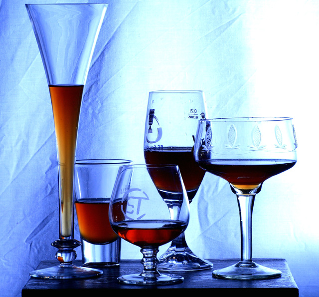
The light seems a bit harsh at the right
The background seems a bit creased
I have prefered some glass without text
Good choice of subject for the challenge however the arrangement is too close to the backdrop (IMO). If it were further away then the creases would be more out of focus and blend more with the image. As they are they are a distraction. Also, the bright white area keeps drawing the eye away from the main subjects.
Nice idea, and I love the different shaped glasses. However I really think a warmer light would have worked much better with the colour of the drinks, and the creases in the background are a little distracting as well.






 Add photograph to your favorites
 Add photographer to your favorites


