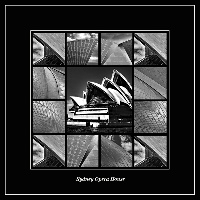
I'm going to have to say that I like the black border better. I'm jealous at all of these wonderful photos that you have. They are all so technically good, and your creativitiy and imigination astound me. That is unfortunately something that will never come natural to me. Nice work on these opera house shots.
They are both nice, but I prefer the black. This is awesome collage!! It's so polished and professional. You have done a wonderful job with these photos of the opera house. It would be nice if you could get them published and become famous!! :) I can see this as the cover of an art book.
I can't pick one I like better. They're both great, and what an amazing job you did with it! (I'm only commenting on this one because it was the second I looked at)
gotta say i loved the white one, but i totally love this one better .. much more dramatic in my opinion ..
i bet the opera house would pay you lots of money to hang this beauty on one of their walls .. made really really really big !!!!!!!! ..
I prefer this one over the white one.
it almost looks like one of those sliding tile puzzles where you have to arrange the tiles to make the picture.
excellent work.




 Add photograph to your favorites
 Add photographer to your favorites


 Photographer found comment helpful.


