I wish I could have commented on this before voting began. Forgive me if I go to far. I'm pointing things out for you to learn from not to be mean.
1) What is the story you are trying to convey here? For me, the image is a bit boring.
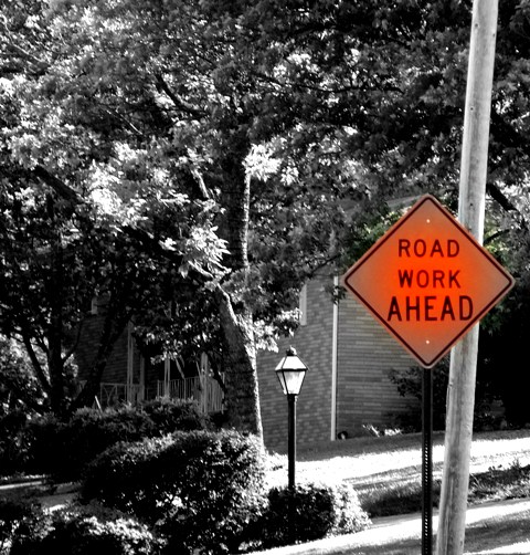
2) The sign is weirdly faded at it's corners. I find it a bit disturbing since I don't know if it's naturally this way or if it was through processing.
3) The contrast of the background is so great that you've lost details in the shadows and in the highlights.
4) The crooked pole behind the sign draws my eyes away from the sign.
Hope I wasn't too hard. I know it's only your second challenge, but I know you probably have gotten many help comments yet either. Hang in there. |







 Add photograph to your favorites
 Add photographer to your favorites


 Photographer found comment helpful.


