Hi Wingy,
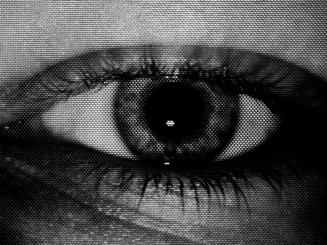
The choice of B&W works real well here but the tonal range is well off the mark. Just above the eye itself (left to right) we have three tonal ranges somewhat of a gray to silver rather then b&w and much brighter then the rest of the photo. The right side of the eye itself is completely blacked out causing you to lose all detail. This left you with no seperation as to where the eye actually ends in relation to the eye socket. The left side is not as bad but you did suffer detail lose here to. Below the eye is alot better as far as the B&W tonal range is concearned but in the center there the reflection of light brings you back to that gray/silver look again. The eyeball itself looks very flat the whites look like blotches there is no detail to speak of. The catch light on the eye looks out of place. It should be there, catch light is always a goal. But this just looks strange. The compostion of the photo is good. That slight off center works well here. The texture concept is a nice touch but in this case it did more harm then good in this photo. Many of the things mentioned above may have been directly related to the texture.
Frankie
Critique Club. |





 Add photograph to your favorites
 Add photographer to your favorites

 Photographer found comment helpful.

