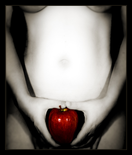
Ack - I had so many other options to enter in this challenge & I don't know what possessed me to go with this one. This is what it originally looked like:
But I had to make it fit within the rules of the challenge & I worried about the border, etc. so I messed with it. Just a little editing, but enough to really change it a lot. Unfortunately, this image really only 'works' as it is in the original edit & really should've been left out if it couldn't be true to itself. Sell-out image! Haha... Well, this is one example of why I would vote for Expert Editing rulesets...
Here are some alts I had come up with:
Statistics
Place: 262 out of 556 Avg (all users): 5.4170 Avg (commenters): 5.1667 Avg (participants): 5.3224 Avg (non-participants): 5.7500 Views since voting: 4846 Views during voting: 514 Votes: 235 Comments: 6 Favorites: 3 (view)
great composition, working title, not a fan of the lighting though...overall image is too contrasty, whereas an invitation should be inviting...crop might be too tight below the apple. superior image though
A little 'in your face' for me (I prefer more subtlety with nude photos, both with lighting and presentation). Good concept, though, and I like how you've retained the color and texture of the apple.





 Add photograph to your favorites
 Add photographer to your favorites


 Photographer found comment helpful.


