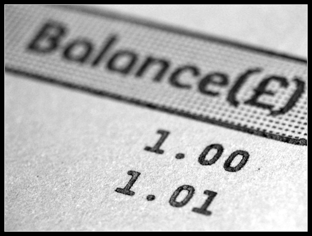
Looks better then my account, and it's on the rise by 1% LOL!
The image needs the title to be understood for this challenge, but this applies for most entries this time, so it's OK.
Technically I like the B&W, the shallow DOF and the contrast, leading to the nice texture on the paper.
Good luck to you
I think this picture needs more depth of field to be effective. If the short range of focus was deliberate, I would say it's a mistake. At least the two numbers should be in sharp focus, even if the word balance was a little out.







 Add photograph to your favorites
 Add photographer to your favorites


 Photographer found comment helpful.


