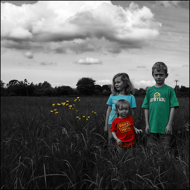
like the color in the flowers. for me, it would have been more effective if either: 1) the children were colored entirely, not just their shirts, or 2) the flowers the the children's faces/skin/hair etc. (i.e., everything, but their clothes) remained in color.
That is a great sky, but their faces are so gray! With their shirts in color, the gray skin looks kinda nasty, especially on the smaller girl. A higher contrast would have helped here, I think.
this is a beautiful photo. that said, i'm not entirely sure if the selective desaturation applied here is enhancing it (unless you're doing t-shirt advertisements or something). alas, i still kinda liked this.






 Add photograph to your favorites
 Add photographer to your favorites


 Photographer found comment helpful.


