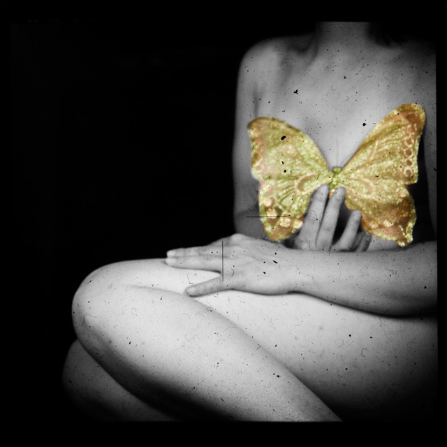
first time through the viewfinder of my hasselblad. I don't think this is gonna score well, but this is something I wanted to do for a long time.
the good part is that I didn't "think" of this photo at the first time. Usually I'm very conceptual, but now I just started and travelled the road to this photo. I like that.
PP: crop, clone some spots, healing brush tool, levels, curves, duplicate layer, apply image, b/w adjustment layer, mask of butterfly, brightness contrast for uploading to dpc.
Found your image after reading STD's review. I have to say the photograph is beautiful, and belongs in a gallery, not here. I can see how some people, while voting for a large number of photographs, probably saw it and didn't see a 'wow' factor, and moved on.
Everything STD said was correct. Actually the 'dirt' made me think of old movie stock footage. (I remember the effect from an older NIN video...) Off center works, as well as the cropping of the model. This is a photo you see somewhere and just have to stop and explore it for a while.
Don't let a low average get you down. Much as I like this site, the photographs that look cool or have a wow factor always score higher than 'art'. Lets face it - the winners of the desaturation were cute, but I wouldn't want any on my wall...
Positives: Well composed and curiously conceived image concept. Makes the voter wonder what it is all about so gives it a lot of viewer interest. Good use of selective desaturation.
Technicals: Taking a picture through the viewfinder of another camera makes it harder to evaluate. The numerous specks and the center framing marks are from the focusing prism of the Hassleblad. Certainly their inclusion in this composition is by design, but is good? That is a dilemna for this viewer and perhaps others. It is good for artistic reasons, but not for technical ones. Makes one ask which is more important. :)
You did a superlative job with the color and BW border feathering. That is what most folks have the most difficulty with. You did it like a pro.
BW quality is good. Higher contrast works well here. You include enough tonality to make it nice, yet contrasty enough to make it unique. The composition is very, very interesting and well done. Croping the head and feet is a good decision. It adds to the uniqueness of the composition.
The Challenge: Selective desat is a difficult challenge topic because it is both hard to do technically, but also difficult to do artistically and appropriately. The viewer wants to know WHY you made your desat choice.
In your case this is not an issue. It draws attention to what is below the butterfly wings and that adds much viewer interest. ;) (Perhaps my maleness is showing through. LOL!!!) The choice of butterfly wings for that purpose adds to the effect as well.
You scored over .45 points above the challenge average indicating that voters thought it a good image, probably for artistic reasons.
This image would do great displayed in the right art gallery. I did not score this image in the challenge and wish I had. I'm interested in the score I would have given it.
Suggestions: No suggestions. I'm tempted to talk about the specks and centering lines but I'm not sure removing them is a good idea. I like them included. The overall composition is great. For this image, there is nothing I could teach you.
Absolutely nothing wrong with this image at all. It's damn near perfect. It is, however, beyond the capability to appreciate to those that want pretty, sharp, clean, simple, uncluttered, no-thought-required photography, or those who are just beginning and have yet to appreciate more subtle presentations. There will be those who will come back to visit this in time, and wonder how they missed it in the first place. And there are those who love it now. I'd say you did just fine. The voters did you a disservice, but probably more due to ignorance than anything else.
you did good .. both in your imaginative approach, your technique and the final result .. the fact that you touched ppl as well makes this a totally wonderful image ... :):)xx
This has an a really antiquity feeling about itm like it has benn taken many years ago....
An ageless quality, that really helps to make this one sing.....
It so deserved a much higher placing.....
This is the first photo I saw when I pulled up this challenge. I was probably not going to vote in this challenge but I will now so I can give this a 10. Awesome shot. Simply awesome. Love the in focus yet out of focus feel and the desat. works perfectly! I love these kinds of shots.....good job
This is so intriguing. I like the pose and the prop and I am assuming the soft focus and all the artefacts etc are intentional to give it an antique feel? It is really quite appealing, I hope you do well and I will be interested to see your submission comments. Good luck





 Add photograph to your favorites
 Add photographer to your favorites

 Photographer found comment helpful.


