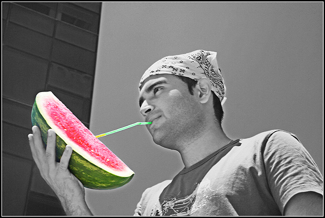
creative idea, but I think It might be even better in color. The brick wall or whatever, is also a bit distracting. Also, there's a white glow around the man that is also a little distracting. But creative concept.
There's a wierd glow around your model. Is that a result of post editing using dupe layer & vector mask? In any case, it is a tad distracting. I do like the idea of th epic. Certainly original and stands out from the lot of pix in this challenge.
Bit of oversharpening problems around his head, and the "Watermelon/straw" thing is a bit of a reach for me... but I appreciate the homage to last time's winner!
Not to be rude, but this is a so-so picture. The angle isn't very flattering, the light is very harsh, the divided background is pretty distracting, and you've got some pretty serious halos around your subject. That being said, I applaud the choice of items to desaturate - between the color and the title, you've brought attention not only to your concept, but to the idea behind the concept. (That is to say, it isn't a meaningless desaturation, or desat for the sake of desat.) This shows me that you've put some thought into the shot, you just might want to work on the execution a bit. :)





 Add photograph to your favorites
 Add photographer to your favorites


 Photographer found comment helpful.


