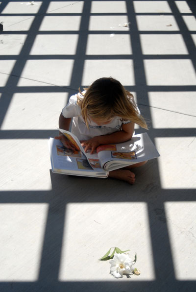
Too many distracting elements (child, flower, diagonal line running through squares, crud on surface in background, dark shape protruding into second row of squares in upper left).
I do like the photo overall but I wish the whites were whiter and/or the dark lines darker and both more crisp. The stuff or debris in the squares is distracting as is the thin lines going across. Would like this more with all that removed. Still good idea!







 Add photograph to your favorites
 Add photographer to your favorites


