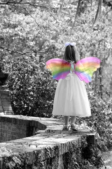
I really had a hard time deciding what to leave colored in this photo. Truth be told, I much prefer the full color version. But I thought just the wings in color gave an interesting look.
Statistics
Place: 129 out of 556 Avg (all users): 5.7972 Avg (commenters): 5.6667 Avg (participants): 5.7101 Avg (non-participants): 6.1042 Views since voting: 1304 Views during voting: 304 Votes: 217 Comments: 6 Favorites: 4 (view)
Positives: Touching capture of a little girl in dreamland with a proper selective desaturation choice to emphasis her imaginative play.
Technicals: Overall technicals are good. Depth of field, sharpness, composition and lighting are all good. It shows none of the usual digital artifacts we are used to seeing in submissions. You handled the color boundary well for this image.
The blue bow on top of her head, though supporting the theme, acts more distractive than not.
The Challenge: 129th out of 554 is a good placing in such a large challenge. You were .4 above the challenge average. Voters like this image but feel it is not top tier. The image cannot be faulted for technical quality so "wow" factor probably played a roll in a lower score. Many voters were probably jaded to selective desaturation by the time they voted on this one.
Unsure, but some voters might have thought having your model on a wall was not a good idea.
Suggestions: You might try desaturating the top bow to eliminate that as a distraction. The wings support the main theme well already.
Consider some serious dodge and burn on the girl herself, possibly using a "vivid light" brush, to give her more "depth" and draw more attention to her. Lightening her hair and locally increasing the contrast on her dress would look nice.
Another thing you might consider to support a dreamlike theme would be an offset vignette centered on the girl.
cute! I have a soft spot for fairies though so I might be biased. ;)
Some improvements... I'm a fan of expression joyful laugh, funny face, excitement, etc. If you didn't want to show her face maybe arms up like shes dancing or mid spin or something? As far as editing, if the dress matched I might have left that maybe with half saturation to break it up a little. I probably would have cropped out more of the top of the image, to me it looks better without the moss and I like that composition, but as always that a personal choice.





 Add photograph to your favorites
 Add photographer to your favorites

 Photographer found comment helpful.


