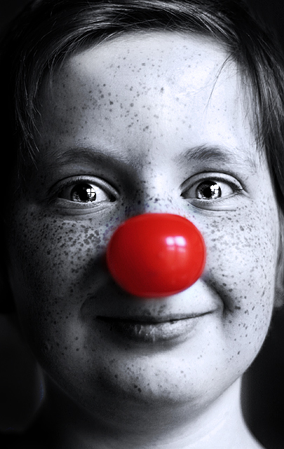
I dont really like this shot. I think the clown nose looks like it's painted on in photoshop. But I decided to post this anyway. In my opinion selective desaturation sucks. It's ugly.
Whatever. I don't think this will score very high.
Statistics
Place: 375 out of 556 Avg (all users): 5.1256 Avg (commenters): 6.8571 Avg (participants): 4.9759 Avg (non-participants): 5.6327 Views since voting: 836 Views during voting: 273 Votes: 215 Comments: 7 Favorites: 0
What a lovely model, great expression, fantastic eyes and catchlights, and those freckles, well... Looking at the reflection on the nose I think perhaps you lost an opportunity to give it even more impact with sharp focus on the nose as well? Good luck
I scored this image a 6 which to me means unsatisfactory but not a failure.
The problem is the nose is out-of-focus, and that is what you chose to leave colored so you draw even more attention to that defect. The expression you captured was perfect and fits the desat theme of the picture well and is otherwise a very nice composition. It does have weak greyscale tonality but that is not as glaring as the nose.
You may have just chosen the wrong central focal point. With the depth of field you already had you could have focused on the nose and still had the eyes and mouth in sharp focus. Another thing you could have done was to shoot at a higher f/number for greater depth of field. If you chose to have the nose out-of-focus purposely then that was the wrong decision. It will just look like a mistake to most viewers.
For improved greyscale tonality you could reduced contrast to bring back detail then increase just the black with "Selective Color" and still retained the BW impact of the image.
with the advanced editing option, i think i would have liked to see you take some of the window reflection down out of the eyes... but i really do like this shot otherwise.





 Add photograph to your favorites
 Add photographer to your favorites


 Photographer found comment helpful.


