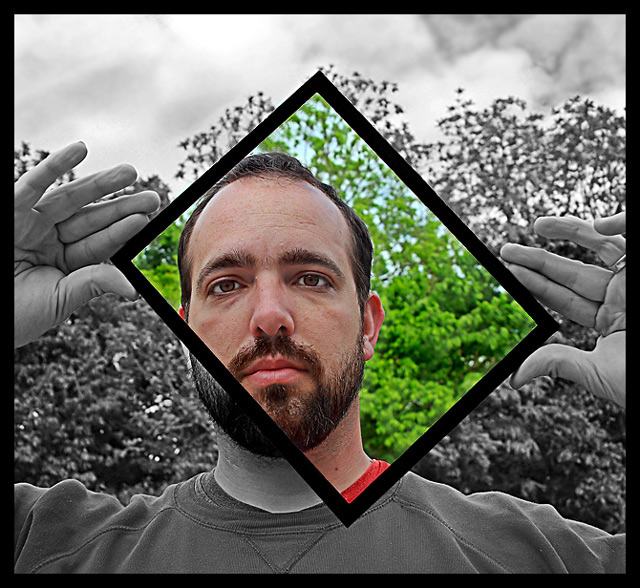
I liked this image and gave it an 8; can't believe it didn't do better (I thought I was looking at a ribbon or at least a top ten here, but then I only picked two of the top ten shots for this challenge, so what do I know)! I thought the basics of the image were great; good composition, good choice of subject, well shot. The desat is interesting and adds to the image, and leaving everything in the frame in color was a good choice to draw the viewer there. I liked it (and still do).
Great photo! The green of the trees within the frame give this picture incredible eye appeal. It draws your vision right to the picture. So how did you do this?
The saturated part looks oversaturated to me, atleast in the green background. It's sort of distracting. The eyes look a tad off.. Either like there was too much done to them.. Or maybe they just turned out that way. Not sure.
A perfect example of challenge, great color contrast with the gray. Only down side is very small amount of white edge pixelization on left by beard and top right by trees. Very minor distractions and very Good work!





 Add photograph to your favorites
 Add photographer to your favorites

 Photographer found comment helpful.


