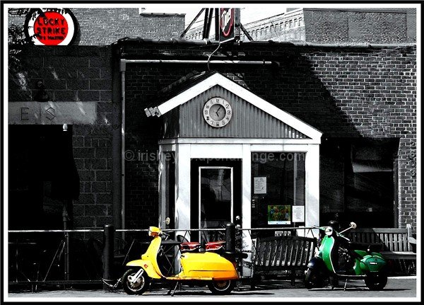
Technicals: lighting is nice. I like the way the building facade pops out of the shadows. The biggest technical issue, IMO, is the softness of the picture. I don't see what lens you used on the shot, but my first guess is it's a product of the lens. I see softness like this in the 75-300 a lot.
The feel: I like the subjects you chose to selectively desat except the sign in the corner. It pulls the eye away. I know you couldn't resist because it was such a nice red color, but perhaps doing a partial desat of it so it's still red, but muted compared to the other colors. My preference, however, would probably be to make it B&W altogether.
The game: Watch your border. People, for some reason, don't like a thick inner stripe.
first of all I'm so disappointed that this image scored so low.
this was one of my favorites, I gave it 10. the image is full of charm,
when I first saw it the first thing that came to my mind was that this must be somewhere in Europe. love the composition too, and you choose the right subjects to be desaturated. IMO so underrated.
this is one of my "silent 7s" I like the complex geometry of your urban composition and I thought the spots of color just added to the chaotic but almost-primary urban feel.
I have to assume that the title is referring to the building in front of which the bikes are parked, but I don't get the point of the pic as it relates to the title, and I'm not seeing the connection to the items that are still in color.
reminds me of my yuoth, i had a lambretta ld 150 back in the 1960s, the lucky strile sign spoiles it a little though, imo, it should have been left b&w, it seems to distract, and it takes away that 1960s look.
interesting, the scooters are awsome. but i dont like the sign in the background red, simply because it makes me want to look over THERE instead of there, do you get what im saying? Makes my attention drive away..ok, now im just rambling!





 Add photograph to your favorites
 Add photographer to your favorites

 Photographer found comment helpful.


