In my opinion this is a great shot, should have scored better, but alas, there were many entries in this challenge.
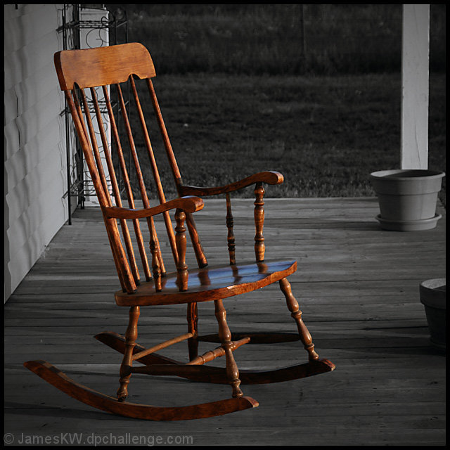
I really like the concept and the use of desat. The only thing that bugs me, as most have said is the composition. For me the frame is just a tad too busy, if you could have moved some of the items in the background, perhaps included the weatherboards as a stronger element (ala leading lines) and maybe an old window or something in the mix.
As far as the background, imo the pots are ok, maybe would be better if something were in them. The wire rack is a real distraction. Other than that I actually really like the image. The lighting and the wood tones of the chair relay a very warm feeling.
I also wanted to add that I think given the competition in this challenge that the score seems fair.
Although I scored this above a 5 based purely on technique, emotionally this photo did nothing for me. It is a "nice photo" but doesnt draw me in at all, sorry.
The photo itself is good. But I think its surroundings are not interesting. Some contrast in the background may have helped but not much because the background is devoid of anything for use to look at after the rocking chair has captured our interest. A rocking chair make us think of relaxing, comfort, cosy, but nothing else supports these or at least the need for these.
Technically, you've done a very good job, both with the original shot, and with the desaturation, although I would agree that the other stuff on the porch is a bit distracting. I think the problem with the image, and the reason that your score was merely "above average" is the subject matter. To me, it's just an empty chair sitting on a porch. It doesn't resonate emotionally, and looks like an exercise instead of being art.
desaturation tends to take things out of their environment. In this case, the chair is just floating in space and has no weight, no heft. If you are trying to tell some story of loss, it is spoiled by this effect. So I all I saw was a competent but pointless use of selective desaturation, and gave it a 5.
The desaturation is nice, but there's something about the composition that bugs me. Not sure what exactly it is, because I have trouble with that myself.
The placement on this I don't get at all; I gave you a ten, and thought it was spot on (it's possibly my favorite shot of the challenge, though maybe tied with the brown dog pic). Good composition, nice conversion for the subject matter. The warm feelings it evokes, the perfect use (IMHO) of selective desat to tell a story (rather than lead the viewer to something that is otherwise a non-subject in the shot, as many of the entries had). Can't explain why it didn't attract more attention. Next time put a naked girl in the chair, I guess, and it'll do better.
Very simple...nice. I would have liked the background better with nothing on the porch since the items on it add nothing and are lite enough to remove for shot. Maybe just a bit more contrast to make your B&W pop more. I do like the feeling it gives...feel like I'm on my grandmothers porch back when I was a child.







 Add photograph to your favorites
 Add photographer to your favorites

 Photographer found comment helpful.


