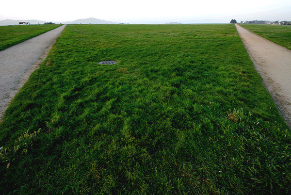
This would have improved a lot if one used the rule of thirds for the horizontal layers.
The horizon would have been so much better by being placed in the rule of thirds.
So much more impact to the viewer, and better balanced in composition.....
One of the more interesting approaches I've seen - I really rather like the geometry of it. It begs a study of the shapes and textures within that grass, and the slight oddness of the drain cover and those building on the horizon. Printed really big, it might almost be a Gursky.




 Add photograph to your favorites
 Add photographer to your favorites


 Photographer found comment helpful.


