Greetings from the Critique Club
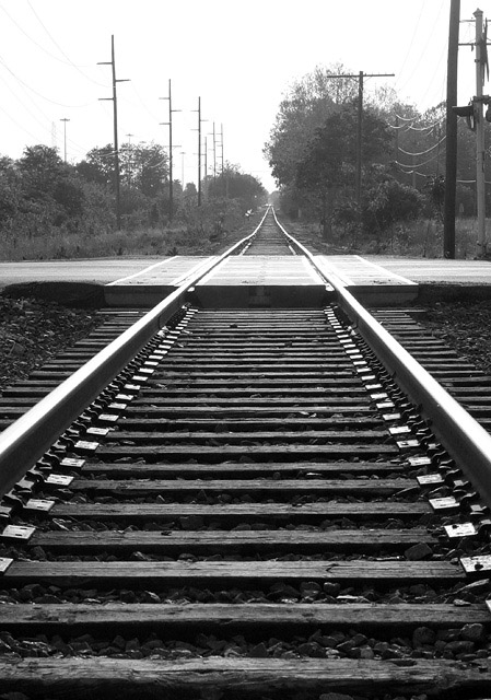
This photo has a nice feel, kind of light and airy. Black and white was certainly a good choice here, and the brightness and contrast you've set suit the subject, and help set the overall mood. The vertical format suits the subject. Composition works OK, although cropping off half the sky helps put more attention on the tracks. Technically very well done; sure, the highlights are blown, but that's hard to avoid with the given light.
But there's no real excitement here. It's just another looking down the railroad tracks cliché shot. Making it exciting requires more interesting lighting, a different point of view, some way of emphasizing a particular feature like the dip (besides the title), or something similar. |





 Add photograph to your favorites
 Add photographer to your favorites


 Photographer found comment helpful.
