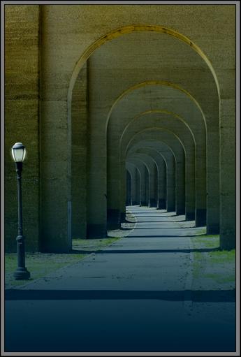
Was just reading some of the comments and wanted you to know that there may be some (I for one) who like it as it is, grey border, crop, lighting and all ... e301 has a point abt the lack of intrigue or human interaction which might attract more interest, but then, it will be a different type of photo altogether. Congratulations!
Despite the slightly small size, I suspect you'll do quite well. Simplicity of composition works very well here. For me, it's a bit too obvious an entry for this - the lamppost giving just enough to balance the receding arches; but I find nothing here more than the recession and that post - no intrigue of composition, no human interaction.
Much potential here. Your cropping and composition is very nice although i think losing a little from the bottom would have strengthened your compostion. The shadows and repeating forms are special and the light is a perfect angular form to contrast with the curves. The image also seems to be lacking a touch of contrast IMHO.





 Add photograph to your favorites
 Add photographer to your favorites

 Photographer found comment helpful.


