I don't know why I came up with this name and how the concept happened, but I wanted to use some of my desktop publishing skills and came up with this. It could go either way - do well or flop badly. I hope it does well of course...
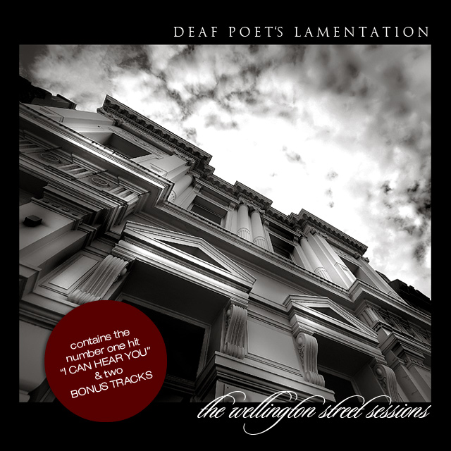
THE IMAGE: Shot near my house in a street called Racecourse Road. This is an old building that had some nice lines.
THE EDITING: I cloned out a power line, then I basically grayscaled, duotoned, dodged, burned and smart sharpened. I seem to be doing that quite a bit lately with some success.
I decided to get the image validated because of the red sticker which is actually text (a large full stop). Text was allowed in this image, so I decided to use it to the full.
I like the final result.
PREDICTION: If it does badly I reckon a 5.8. If it does well, a 6.4. If it excells, nothing better than 6.6. Let's see how we go!
POST: I am sitting in a slow internet cafe in the heart of Nairobi where I have been without internet support for a few days, and deep withrawl symptoms from not pushing an UPDATE button for 5 days!
Thanks so much for the votes and the ribbon. This is my third in about 5 weeks and I am loving it!
Statistics
Place: 2 out of 153 Avg (all users): 7.2055 Avg (commenters): 8.0833 Avg (participants): 6.8171 Avg (non-participants): 7.4380 Views since voting: 8556 Views during voting: 446 Votes: 219 Comments: 62 Favorites: 3 (view)
Very well-seen and terrifically executed. The voters have spoken, and I cannot see anything to add in the way of a thoughtful critique. Congrats on another ribbon to add to your ever-increasing collection. Nice work! My favorite part (aside from the great image) is the number 1 hit...clever!
It's a little known fact that Stevie Wonder plays keyboards for this band, whose frontman, Karpov Key, amazingly was indeed deaf. And the drummer never spoke. They are more commonly known by the name they switched to for their re-ponymous third album: "The Three Monkeys"
I really like the way that this photograph looks. The title that you have chosen for the band, "Deaf Poets Lamentation", also really catches my attention. I know that I wouldn't hesitate to further my knowledge of a band with that name. Very well taken.
Very striking photograph. Not sure how it relates to deaf poets, but then a whole lot of album covers have nothing to do with the contents. Nice presentation as well.
I really love this! The grayscale is great and the contrast between the smoothness of the building and the blur of the sky if very stricking. Great angle too.
Nice PP on this one. Actually looks like a cover I've seen somewhere. Been through my stack and can't find it. At first I didn't like the red sticker, but came to appreciate how it added some realism to the cover. Should top ten.
Great exposure. The composition seems a bit off. I think it would look nice if the corner of the main building in the top left was the corner of the picture. Excellent b&w conversion, the blown out spot in the sky is a bit distracting, the only to avoid that would be to come back at a different time, but you may have lost some of th shadows on te building.






 DEAF POET'S LAMENTATION
 Add photograph to your favorites
 Add photographer to your favorites

 Photographer found comment helpful.


