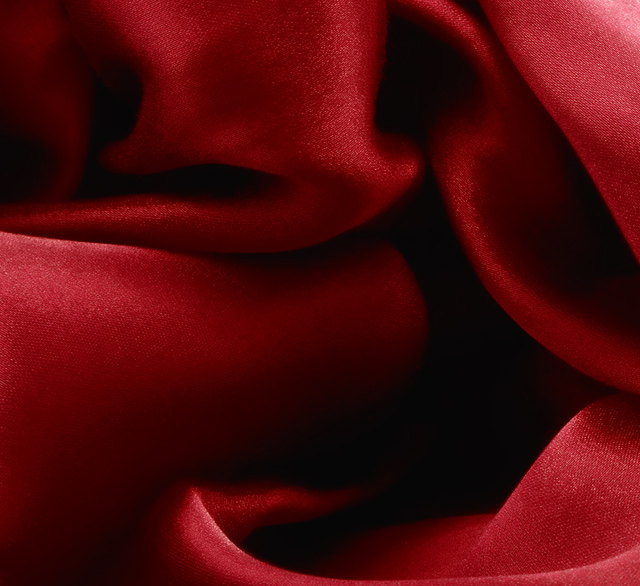
It took me an insane amount of time folding and refolding this satiny cloth before I got a pattern of folds that looked interesting (to me, at least). I'm rather happy with the result.
Maybe some (or even most) people won't see this as depicting "silky-smooth" but I aimed to create a study of smooth, silky fabric, and met my goal. :)
Statistics
Place: 49 out of 144 Avg (all users): 5.6993 Avg (commenters): 5.7000 Avg (participants): 5.3281 Avg (non-participants): 5.8063 Views since voting: 968 Views during voting: 432 Votes: 286 Comments: 25 Favorites: 0
What a lovely picture. I swear I can feel the soft, smooth texture just from looking at it. The shadows and highlights work perfectly, and there are so many nice curvy lines for the eye to follow, you can just get lost in this picture for ages.
Oh wow, just read through the comments, and only just noticed the woman reaching out for the heart. But she's so there!
I am also surprised that this didn't score higher, as it works so well for me, re this challenge of "Smooth and Silky".....
The rich reds looks so warm and inviting and the dark areas add depth and shadows.
In all I like it very much..... Well done.
Very first impression from the thumbnail: I want to jump in.
second reaction... so what? why was this photographed?... that was before I saw the challenge.
visually it's kind of cool but nothing is interesting me except for that first reaction. Could look better on a nicer monitor... the one I am temporarily on is unpredictable.
OK well I am writing this without looking at other entries so feel free to disregard as appropriate
1. I love the folds that you have created, they give a real 3D feel to the image.
2. The reds and the blacks are very well balanced and compliment each other well
3. My only possible issue is that you have almost photographed this 'too well' for the silky smooth challenge. The outstanding focus means that you can pick out the weave which gives it a slightly textured/rougher feel
A very good image but possibly (in terms of the challenge) could have done with being slightly softer focus
Lush red and lint free springs to mind (not silky, since velvet is more of a brush texture). Looks a little anthropomorphic too. A little beasty eye peeping out of the darkness there would....
actually, my favorite thing about this is that it's NOT silky smooth. I like being able to see the weave of the fabric. If this were all glowy and smooth it would be DPC-kitsch city.
It's tough to make a shot like this interesting, though. You've got to find the right abstract composition, and what makes it "right" cannot be defined. There has to be something surprising about it, or energetic. Do you realize your shadows are very close to depicting a woman in a dress holding (or reaching for) a big heart? That would be one way to make this surprising. There are others as well.
Personally, I'm better at finding surprises in images than putting them into my own... :)
Well, first, congrats on meeting your goal! :) I like the shapes you created, and the dark part in the lower right is placed well to draw my attention. I think the other commenters are right that a little more light in there would give me something to see when my attention goes there. Even shining a flashlight in there would help. Finally, congrats on your new 3rd-best score!
Composition: I like how you have concentrated entirely on the fabric and the beautiful soft folds contained within.
Technical: I feel a little bit more control over the lighting in the shadows...maybe a longer shutter speed to bring in more light...this would have given the viewers more information...especially those viewers with badly calibrated monitors. They vote also.
Overall: I think you concentrated on the challenge subject well...and did control your Technicals well...therefore you just need to concentrate a little more on the 'wow' factor to bring home the ribbons.
Positives: A very nicely conceived and executed image. The interplay of light and shadow is its best feature.
Technicals: Sharpness, color, tonality and arrangement(for those of us that like abstracts) all are very good. Red always seems to be an eye appealing color.
The center is a little dark.
The Challenge: Your image scored almost 5.7; good by general DPC standards and above the 5.48 average for the challenge. Basically DPCers are trying to tell you that the image was above average but not super good. My speculation is they liked it but thought it weak in the challenge topic area. They probably thought it lacked "wow" factor to.
I scored your image 9. I like abstracts, feel it meets the challenge nicely and think it is very good technically. When I can't find a lot to fault an image for I give them decent scores. I see no reason to change my thinking on this image.
Suggestions: Perhaps you might consider lightening the center with a little "vivid light" painting on a 50% greyscale layer using a white brush to bring out more central detail in an eye appealing way.
I liked this shot, great job with the lighting.
*I did a similar texture shot with patterned silk but gave up on the refolding a bit too soon and the result wasn't as luxurious.
I think the folds and the color really impart a luxurious, silky feel to the shot. It's great as an abstract. Possibly a little gaussian blur or neat image would have made it smoother, but I kind of like the way the texture has a shine of its own. Your lighting is fabulous. Congrats on a new top fiver :)






 Add photograph to your favorites
 Add photographer to your favorites

 Photographer found comment helpful.


