Author Thread Comments Made During the Challenge
Post actions
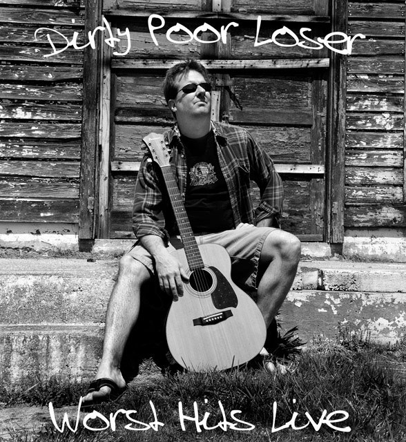
B&W works very well for this, and there are some nice textures in the picture. However, the centred composition is a bit dull, and the POV is unimaginative. And is the picture intentionally tilted clockwise?
Post actions
He doesn't look a lot like a "poor loser", which is a shame since the photo is really good. Nice lettering.
Post actions
Great shot. Black and white works well here.
Post actions
For fans of Jack Johnson, haha
Post actions
Love the title, like the font, but he doesn't look too terribly dirty or poor. :-) Good concept!
Post actions
Post actions
love the 'worst hits' part! 8
Post actions
Another great title, love this, great work! 9






 Add photograph to your favorites
 Add photographer to your favorites


 Photographer found comment helpful.


