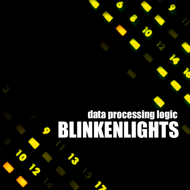
Camera Work/Technical: Crisply focused for shooting lights and well-captured. Just glancing at it, I didn't really see much to the image. That may have cost you and tenth or two from the voters. Now, spending some time with it, I see what you have captured here.
Lighting: Your lighting is solely provided by the subject of your image. Nice idea and great concept.
Composition/Content: The tilt definitely adds interest to this capture. You also chose a great font that fits right in with the overall feel of the image.
My Opinion: I think that many voters passed it by, as I did when I first saw it. Even still, you managed a strong score and a well-deserved finish.
Thank you for the opportunity to provide a critique on your entry,
Eric
They did the Chemical Brothers one better, creating completely binary music based on time-lapse photography of lights going on and off in downtown Hamburg overnight. Unfortunately, the Chemical Brothers were far enough for most people and Blinkenlights was their first and only album.
This works for me as an album cover so good job there. If you care at all about your score and how to make it better I would have tried to get more wow factor into the shot somehow. The photo itself doesn't have any so at least make the text more interesting such as having the part that says "Blinkenlights" look more like the lights in the background. Just a thought.
Awesome. A photo that has a graphic-design-ey feel... Don't know if this makes sense but, I want to say that this stands out from a lot of others because it looks like it was just MADE to be an album cover, instead of an album person just happening to pick a picture that fit.





 Add photograph to your favorites
 Add photographer to your favorites

 Photographer found comment helpful.


