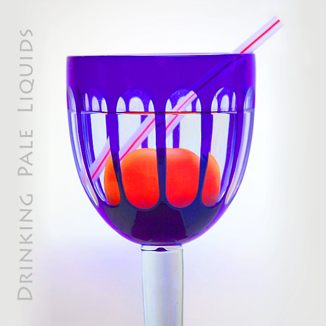
A tomato, a straw and one of our new wine glasses.
I liked the colour of these wine glasses and thought it would create a good refraction image. The straw was included to create the effect and the tomato to impact with the blue glass.
I know that the liquid is not parallel with the top of the glass. My desk is obviously not horizontal..
I will probably get messages that this is a well tried theme. I know this but I still think it looks good, and for me works as an album cover.
Statistics
Place: 81 out of 153 Avg (all users): 5.6009 Avg (commenters): 6.3333 Avg (participants): 5.1818 Avg (non-participants): 5.8382 Views since voting: 859 Views during voting: 356 Votes: 213 Comments: 8 Favorites: 0
Camera Work/Technical: Nice focus and crisp colors. I do see some strange aberrations where the red and the blue meet up.
Lighting: Nice, even lighting. Your white background also works very well with this one.
Composition/Content: I also noticed the tilt, but I like that you chose to keep the waterline horizontal rather than the glass. It almost makes me want to see it tilted even more. I think that it would better fit the 'band' idea.
My Opinion: 5.6 is a pretty strong score for what you captured here. It serves better as a still life than something that makes me think album cover.
Thank you for the opportunity to provide a critique on your entry,
Eric






 Add photograph to your favorites
 Add photographer to your favorites


 Photographer found comment helpful.


