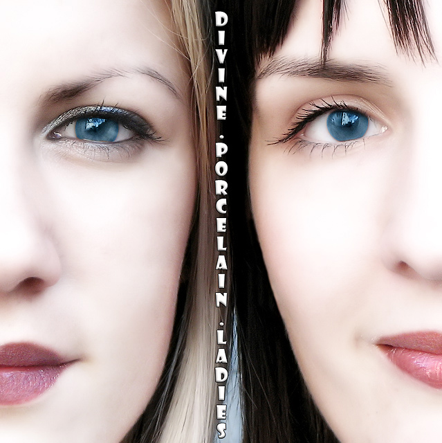
Initially I thought about using 3 girls in the photo but one of them canceled in the last minute so I went with the 2 girl version.
Last week I learned a cool "porcelain" technique so when this challenge came up "porcelain" was the firs word which popped up in my mind. The shot was taken outside so the only light source was the sun.
Statistics
Place: 4 out of 153 Avg (all users): 6.8716 Avg (commenters): 7.7333 Avg (participants): 6.3375 Avg (non-participants): 7.1812 Views since voting: 3855 Views during voting: 478 Votes: 218 Comments: 24 Favorites: 4 (view)
I keep coming back to this one. The similarity of their skin- the porcelain effect- really draws my attention again and again to their differences. Their eyes, eyebrows,lips, noses. Good job!
The image is FANTASTIC. It really conveys your title. The women are lovely and really compliment the look of each other nicely. Makeup seems to be chosen with care as the colors are nice together. The neat-imaged look is usually bad for portraits when it is overdone but it works BEAUTIFULLY here. I love how the faces are symmetrical but still have these asyemetries about them, such as eyebrow shape and hair on the forehead; makes things very interesting. I also really like the two smiles that are at the same intensity - not too much of a smile, but enough. Only things I would suggest on the image are maybe to get rid of so many reflections in the eyes, and possibly (but this is drawn attention to with the text and wouldn't be so bad with the image alone) have the hair arranged so there is no background showing. Other than that, it's just really spectacular. I could really see the image being used to promote these two women in a band.
But I will be honest with you. I feel like this is so far underneath what it could have been. That is because of the text. The font seems horribly cheesy to me! I feel like it simply does not in any way do this lovely image justice. I still gave you a good score but it would have, with a nicely elegant, or simple and understated text, been a ten.
beautiful eyes, you're captured them magnificently. It would be be good to get rid of the reflection in them though. I like the areas of intense colour surrounded by soft whites etc. I'm sure the font does justice to the rest of the photo.
Okay, I'm guessing this is Giorgio's. That's because he seems to
have a never-ending supply of beautiful women who will pose for him.
And this is certainly beautifully posed, as well as beautifully
executed.







 Add photograph to your favorites
 Add photographer to your favorites

 Photographer found comment helpful.


