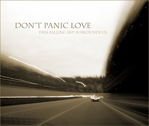
Photo converted to b&w and edited for tones in Camera Raw. Sepia tone and contrast boost in Photoshop CS2. Text color chosen from tones in the scene to complement the overall look. Then image was flattened and converted to JPEG.
I just want to say that I know the photo isn't technically perfect but that isn't what I was going for. In all honesty, I was wanting a messy, "panicing" sort of photo to help the band name ....
If you achieved what you started out to achieve, wouldn't that make this technically perfect?
Thanks to everyone for the great comments and for all of the votes. I just want to say that I know the photo isn't technically perfect but that isn't what I was going for. In all honesty, I was wanting a messy, "panicing" sort of photo to help the band name and album title. Another thing: the spots on the windshield are actually from rain (but I do agree with heater vent comments and the light trail comments). Thanks everyone.
First of all, congrats on a new personal best, as well as cracking your way into the 6's with only your third entry. A well-deserved score and top 15 finish!
Camera Work/Technical: While the photograph is technically poor, it was the perfect creation for this challenge. Nicely seen and very, very well-executed.
Lighting: Also excellent for this capture. You created a very somber mood with the lighting and toning that you offer us.
Composition/Content: I'd like to see those two short light trails on the left of the image longer, but that's about all I'd change.
My Opinion: This is one of my favorites in the challenge. I think that increasing your exposure by 3 or 4 more seconds, thus making those two short light trails on the left longer, this one would have cracked the top 10.
Thank you for the opportunity to provide a critique on your entry,
Eric
Fantastic work. Now this really looks like an album cover! Perfect name for a band as well. Certainly not a typically popular kind of DPC photo, but screw those guys! One of my 2 10s in the challenge.
Fantastic composition of photo and placement of text! I love it! The colors are great, and the sense of motion makes me want to put this CD in my car as I go on a road trip. My fourth favorite in this challenge. 10!
Well this is perfect! When is it being released? :P
ETA: Making some late bumps and came back to this one. Unfortunately the voting scale won't allow me to bump this any higher so I'll just say this is the best in the challenge. There aren't too many in this challenge that were perfect in both title and image. This I can easily see as being a real cover something I don't expect to see from the ribbon winners but maybe I'll be wrong and this is right up there. Good luck!
OK, guilty of cherry picking the first one i'm voting on; from all the thumbnails it was this I was first drawn to. Might be purely coincidental, but you also appear to be much of a coldplay fan (font, the Don't Panic bit from their blue room ep). Gives an air of autheticity about it. The image itself is very nice; technically flawed but in a good stylish way, soulful, quite moody, very fitting. says a lot too; journeys, music on the radio... makes one thoughtful. this photo could only ever be on a record sleeve.
My First Weighted Scoring System ™; composition + technical 2/3, challenge 1/1, post processing results 1.5/2, ooooh factor 3/3, originality 0.75/1 = 8.25 (rounded to 8)
Love the band name and intertwining title, and the image is, well I don't know what it "is", I just like it very much. :) This could pass for a real album cover. 10
This is DPL's first and what many consider to be their best album. They would always name their albums with a phrase that seemed to naturally follow "Don't Panic, Love..." such as "Light Has Entered You" and "Time Never Waited", but soon their titles seemed more and more ironic. "The Wheat is in the Thresher" was followed by "I Already Left," which not so coincidentally was released after the band had broken up, at which point they slowly faded from memory, with the exception of a couple of road movies co-starring the lead guitarist and the drummer, "Panic Attack at 70MPH" and "Panic Attack 2: Pile Up!" The failure of these movies was largely due to creative differences between the musicians cum actors and the director, known primarily for his action movies. It seems the actors wanted the movies to be sullen, calypso dreams, in the mood of their first album cover.
This works! It's absolutely something I'd expect to see on a real album cover. I like your band name, doesn't sound half as contrived and unlikely as most in the challenge (though I know most are tongue in cheek). I like the image too, oddly enough.
I'm sure what to make of this. Its works really well as an album cover. I like the roughness about it yet its smooth at the same time. I think I'd like it better if it didn't have that top white light trail.
This really works for me. Somehow familiar but not sure why. Very 'live and on the road' feel suggesting that rock n roll also involves hours of tedium on tour.
1 Clean your windshield and 2 zoom in a bit to avoid the defrost vent reflection from showing.... or a slight crop which might not go well for you personally. Anyways I like it.







 Add photograph to your favorites
 Add photographer to your favorites


 Photographer found comment helpful.


