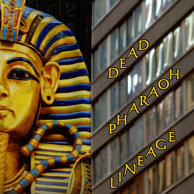
Hmmmm....well I shot this with nothing in mind except that I like the contrasts between the building and one of the many King Tut banners around town. Single image of the banner against the building. A little unimpressed with the title but it was the best I could come up with...'D' and 'P' were note a problem....'L' was...oh well.
Post: Convert from raw in PSElements 3.0 with a +0.67 exposure compensation. Power Retouche Dynamic Range Compressor. Layer adjustments for levels, brightness/contrast and hue/saturation. NeatImage. Layer of Curves Adjustment. Masked the building and did a layer of levels on just the Tut banner. Sharpen. Crop. Added text. Resize. Sharpen.
Statistics
Place: 111 out of 153 Avg (all users): 5.2174 Avg (commenters): 6.5000 Avg (participants): 5.0500 Avg (non-participants): 5.3228 Views since voting: 1094 Views during voting: 349 Votes: 207 Comments: 2 Favorites: 0
Cool image, the only thing that throws me off is the color of the font, I don't know what other color I would have used, maybe its the black out line, or maybe if there were more of a border between the pictures. Nice work, great idea. 8.





 Add photograph to your favorites
 Add photographer to your favorites


 Photographer found comment helpful.
