Hey there from the Critique Club
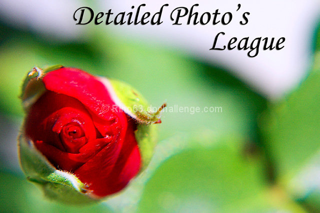
Camera Work/Technical: Terrific depth of field use. I completely disagree with Tygerr. I think that the shallow depth of field is one of this one's strengths. I would like to see just a little deeper depth of field, but I do like the bokeh-esque feel that you created.
Lighting: Pretty nice, but that large, white area at the top of the frame is very distracting.
Composition/Content: Nice rules of thirds use, and that works nicely to pull the eye onto the subject.
My Opinion: I think that this one could have been executed better, but even with that, 4.6 is a bit low.
Thank you for the opportunity to provide a critique on your entry,
Eric
|






 Add photograph to your favorites
 Add photographer to your favorites

 Photographer found comment helpful.


