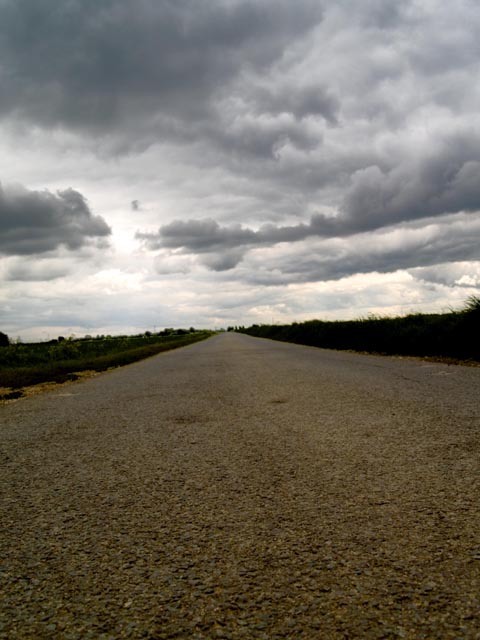
Road converges into single point, taken from road lebvel to emphasise the foreground texture and a slight tilt to add more interest and not a simple straight road.
hue, contrast adjusted, no cropping
Statistics
Place: 172 out of 195 Avg (all users): 4.7783 Avg (commenters): 4.1429 Avg (participants): 4.5467 Avg (non-participants): 4.8973 Views since voting: 784 Views during voting: 290 Votes: 221 Comments: 9 Favorites: 0
From the title and your comments, your intent here was to emphasize the road. And this photo does nicely capture its texture, color, shape, and length. But the sky really steals the show here. It's bigger, brighter, more dramatic, more colorful, and just a lot more interesting. The road just can't compete!
To increase the focus on the road, the camera needs to be pointed down so that there is just a bit of sky at the top of the photo. Shooting close to the ground is great, as is the vertical format. Tilt could also be effective here, but it needs to be exaggerated so viewers know it's intentional. The slight tilt here looks like carelessness. A smaller aperture would have increased the depth of field and provided extra sharpness that would have really helped here. And converting to black and white could be considered, although that does change the personality quite a bit.
But the sky here is so wonderful that I think it would have been a better main subject, leaving the road as a secondary element. Taking it from road level would still be great; the road texture would add interest without detracting from the sky. But point up so the road only take about a third of the photo. And I'd want to see a straight horizon and a horizontal format to make the most of the sky. It would certainly a much different photo than what you intended here!
and leaning a little to the left. Its a little dark and dull though. Try playing with brightness/contrast and midtones after the challenge and see if you could brighten it up a little. Might be difficult without blowing out the clouds but, its worth a try.
The tilted horizon is just not tilted enough... either tilt it more or don't tilt at all... takes away from the pic. Also, dead center horizon... would have liked to see more sky, it looks nice and threatening.





 Add photograph to your favorites
 Add photographer to your favorites

 Photographer found comment helpful.


