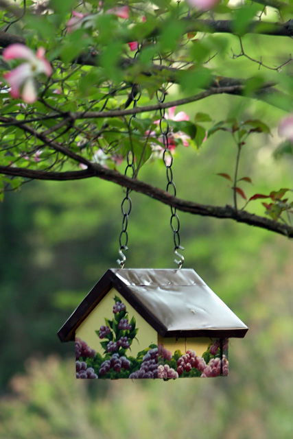
I liked the color an serenity of this little bird feeder house. Granted, the subject is a little centered but I did try to compose it along rules of thirds.
I am not expecting a real high score as I can see that others may not find the subject all that interesting. But I think the layering and background is rather nice.
Statistics
Place: 505 out of 617 Avg (all users): 5.0132 Avg (commenters): 4.8889 Avg (participants): 4.9576 Avg (non-participants): 5.2121 Views since voting: 890 Views during voting: 202 Votes: 151 Comments: 11 Favorites: 0
Very nice colors, i actually like the subject, found it very nice to look at. For some reason i would like to see this in a landscape view with more of the background on the left side. A slight burn would make the colors richer too. Also i have to agree with the two that thought it needed more sharpness on the house, you can really see it in the s hooks on the chain. Overally its a nice picture and i would have placed it higher.
nice lighting on the LTH. A lower crop to remove the competing branches may have helped, stepping to your R to take advantage of the darker background may have helped too. as it is the very bright area in the LR corner also competes with the LTH





 Add photograph to your favorites
 Add photographer to your favorites


 Photographer found comment helpful.


