The title meets the challenge, but don't ask me more...
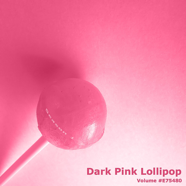
Postprocessing: white balanced + cropped + rotated + a little play with other raw settings, converted from raw, noise reduction, level adjustment, added a dark pink solid color layer (color mode), added text, resized and sharpened.
Statistics
Place: 49 out of 153 Avg (all users): 6.0138 Avg (commenters): 7.4444 Avg (participants): 5.7683 Avg (non-participants): 6.1618 Views since voting: 7057 Views during voting: 398 Votes: 218 Comments: 14 Favorites: 0
I scored this one well in the challenge - liked it then, like it now. Very clever and very well lit to have the nice variations in the pinks. I like how it seems like you're almost looking up at the lollipop, that it might fall at any moment.
Definitely meets the challenge, excellent lighting as mentioned, very good detail, and well composed. Score is quite good in a very competitive challenge. I've been trying to think of something to tell you to "make it score better" but I really just don't see anything. It's perhaps not "omigosh!" enough - it's simple, well-done, understated, and for that, it scored very well here. Keep up the great work!
Back to comment. What I like best about this, is where and how you've placed the "Season 1" text. Excellent idea. The colour looks a little flat on my screen, but no matter, I like the overall subtle class in the work. Good luck :)





 Add photograph to your favorites
 Add photographer to your favorites

 Photographer found comment helpful.


