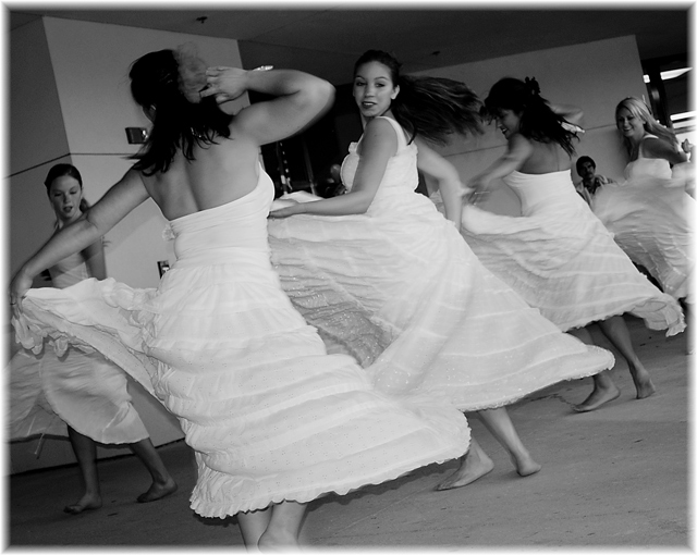
I love the action and swirl of the dancers dresses. Nicely tilted angle too. Browsed your portfolio and i must say i am impressed by the quality of much of your work.
As can be easily seen from the comments and challenge score, it's an appealing image. There's motion, a discernible diagonal (the flowing dresses), real feet with ankles and toes and an expressive human face in the middle that has anyone looking on. It's a fun shot, and as such, the tilt only helps it, IMO. I image this taken even closer to the central point of interest, the dancer's face, which would leave the external figures diminished to incidental parts. The blur would likely appear stronger, too, only adding to the pizazz with a little visual music.
Now, you could (play with curves in pp to) bring out those delicious whites and skin tones while darkening the ceiling and some of the wall, perhaps (to hide the fire extinguisher and fixtures), but this would, unfortunately, be controversial in Basic Editing. As I said already, it's a fun shot, and as such, I can appreciate and enjoy it as is. -What I'm thinking, quietly, to myself, is that an even better shot is hiding in the shadows.
fun, nice capture of movement. the only thing that bugs me is the box on the wall beside the further left subject. but i realize in basic editing, not much can be done.
Back to comment: I love the motion in this image. The tilt brings a dynamic aspect to the composition that earned the only 10 I awarded this challenge. Nice job.
Looks like they are having a ton of fun here. Looks like you used your flash though. I like the border, as I have used this border before too and people liked it. Hey maybe we could start a trend.
Really nice, i like the camera angle, the mood is great too.
The motion blur brings out the fact that they are in...motion, and not 4 people just posing. I had to say that because some people might comment that there is blur
The tilted horizon detracts a bit, IMO, especially around the ceiling of the room. The B&W conversion could have used just a bit more contrast. Subjects and composition are good. Overall a 6 from me.






 Add photograph to your favorites
 Add photographer to your favorites


 Photographer found comment helpful.


