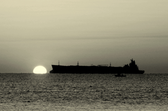
Maybe it's just my aging vision and monitor, but I swear there is a smidge of color left in the sky -- some very pale blue striations. Whatever it is, it's a great sky and a great image.
That horizon is level as far as I'm concerned. If it appears tilted, I think it's an illusion because the profile of the ship isn't level.
I love this shot. It's going straight into my favs column.
I like the shot. I like the way only portion of the sun is visible. A more interesting sky would have made this nicer...if only the sky would cooperate more when we have the time to take photo's.
Seriously cool. You really went right out of the box with this one. Love the contrasts and tones you caught. The photo evokes colors of the sunrise, despite being in BW - interesting what the eye does. I love this.
Interesting tones in the sky here (sort of yellowish). I think skies work best in B&W when they are dramatic, and sunsets tend to be subtle. Slight variations in color often don't come through, or come through as uneven gradients. Here, the sky is okay, but what was probably a strong feature of the color version gets underplayed in the conversion. The water plays a bit better, but the image is a dark overall (possibly to save the sky). I might have leveled this, cropped a bit off the top, and upped the exposure and contrast.




 Add photograph to your favorites
 Add photographer to your favorites


 Photographer found comment helpful.


