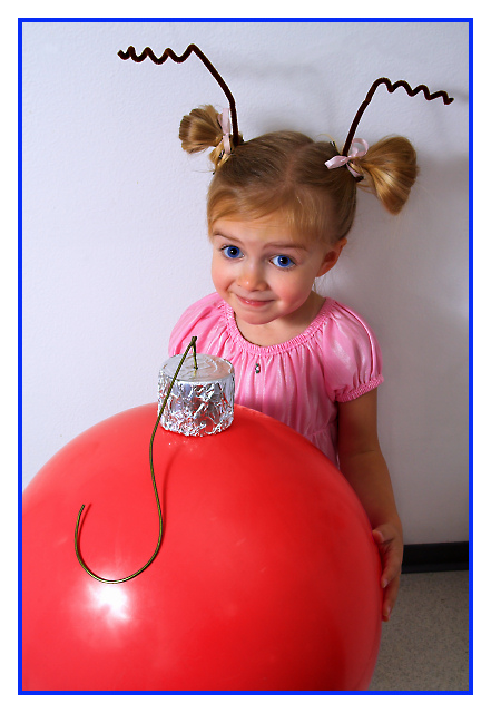
A little model, a large ball, some tinfoil, a spray paint can lid, pipe cleaners, a coat hanger, and duct tape (of course). And a ton of editing to make it more cartoonish. And don't forget the help from my wife.
I predict about a 6 -- I've helped the image a lot, but I wish I'd compressed the tonal range better when I took the picture (someone wasn't very patient). I also wish I'd thought out where and how to shoot the picture better.
Editing:
Export RAW (RawShooter)
Curves, crop.
Select ball and change its color to red (turned out to be quite a hassle to get it to look right especially with the tin-foil).
Tons of cloning on the ball (it was a rubber ball, after all)
Cloning and dodging on background (it was a kitchen wall, and it has lots of battle scars).
More curves.
Turned eyes blue (select, tint, blur, on separate layer).
Resize, sharpen, border.
Predict: Around a 6.
Statistics
Place: 13 out of 74 Avg (all users): 6.4667 Avg (commenters): 7.7857 Avg (participants): 6.6170 Avg (non-participants): 6.4327 Views since voting: 25779 Views during voting: 631 Votes: 255 Comments: 41 Favorites: 4 (view)
This is an adorable photograph and a great concept. It looks like you put a lot of effort into the costume and props here, and that effort paid off. It appears that you had a little trouble with your lighting, however, as evidenced by the strong shadows on the right side. This photograph would have benefited significantly from either a fill light or a reflector on the right side. The molding on the right side is also a touch distracting, but forgivable -- Cindy Lou did, after all, live in a house, so the molding is believable.
The blue on the frame seems a strange choice of color. I'm guessing you want with that to pick up the color from the model's eyes, but it just doesn't work for me. I'd have preferred to see the frame a different color, or no frame at all.
Overall this is an excellent image. If you can maintain this level of creativity and work out the lighting issues, you'll be a ribbon contender.
Adorable shot! Lacks punch to me because the lighting is pretty flat and the image needs more contrast. Although not always possible with little ones, it might bave been cute to maybe have her head resting on her hands on the "ornament". It would serve to bring her forward more instead of having the prop be so much more in front of her that she's sort of hiding behind it. I would also have left the floor out.
I dunno. I'm really big on using props minimally and focusing on the expression (especially with children), so just some ideas.
The subjects (props, costume, and especially the model) deserve a better backdrop and better lighting! The glare on the ornament is bad and the shadow on the wall is unfortunate. However, you get *adorable* points from me.





 Add photograph to your favorites
 Add photographer to your favorites


 Photographer found comment helpful.


