I think it stinks, but spent a lot of time on it so I want to hear how to improve this kind of stuff.
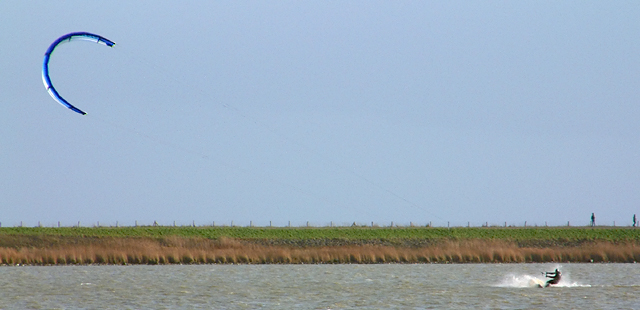
The reason why I think it stinks? Because it has got to much empty space and I don't like that dike going trough my frame. It also lacks fine detail.
Reasons:
(1) It is winter, there was only one surfer there, else I would have chosen wideangle and included 30 of these guys. In the summer it looks far better with all kind of different colors.
(2) Light, the sun was at such an angle and with only one subject I had no choice but to shoot from this position at this angle
(3) The lens, 602 Fujinon EBC with an Olly TCON17 on it. It is too soft and even at F5 there was an enormous amount of Chromatic Abberation (took it by desaturating the magentas a bit)
I took out some birds that looked like dust spots, that's the only december editing on this one.
Statistics
Place: 79 out of 139 Avg (all users): 5.3537 Avg (commenters): 6.7143 Avg (participants): 5.3023 Avg (non-participants): 5.4262 Views since voting: 1018 Votes: 147 Comments: 8 Favorites: 0
I understand what you are trying to do here. I also think that this would be a nice shot at 8x10 or even better at poster size. At the size that we are alowed to post here it really doesn't have much punch. You can hardly see the lines connecting the two parts of your subject. A closer shot of only the skiier would IMHO been more potent.
TC
Horizontal cropping works perfectly here, helps composition look very interesting. Nice and simple. Colors looks flat except the parasail which helps to pop out of the frame.






 Add photograph to your favorites
 Add photographer to your favorites


 Photographer found comment helpful.


