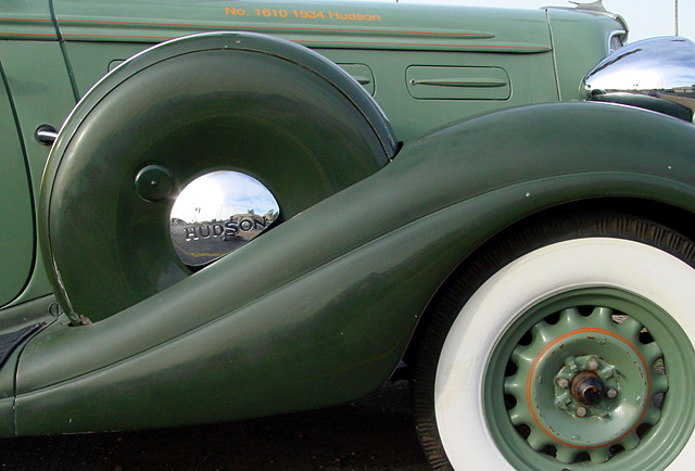
See the mcfarland shot was was tighter and with a slight CCW rotatinos so that the wheel fender and the spare carrier were level. THis however looks more natural from many respects and I like as much if not more. very nice, like the reflections in the chrome....still think a slight CCW rotation might have made the detail lines straighter and more please if only to me.
Nice job of not getting in the reflections. I love the simple tonal theme here! You could use just the slightest bit of fill lighting around the spare and between tire and fender. Other than that it's a very nice shot.
TC
This angle is not conducive to chrome, as you have put yourself in the picture with your head just above the "S" in Hudson. A slight change in the angle would've gone a long way with this shot, and not just in regards to you being in the photo.
It's a shame you had to crop this so tightly -- the car looks incomplete with hints of it existing outside the wheel and spare. Perhaps a tighter focus on the wheel and spare, ignoring the hood more, would have made for a better photo, though you'd lose the lettering which is somewhat indistinct anyway.
Nice clear focus. I do think your composition could be improved. We don't get to see the full white wall and tire or the fender. [which sweet lines]. I see that you are showing the spare tire cover but that along with the tight crop at the top seem to give this a chopped feeling. Just my opinion. It's technically a fine shot.






 Add photograph to your favorites
 Add photographer to your favorites


 Photographer found comment helpful.


