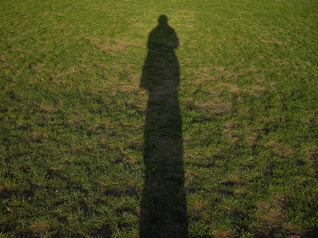
The Dr. Seuss book actually used silhouettes, not shadows, but this is close enough. And the distortion caused by the low angled light does make it rather "Seussesque". So it certainly meets the challenge for me (although voters who never read that book may disagree).
I do wish the shadow was darker, with sharper edges and with advanced editing this would not have been difficult. And I agree with cpanaioti that a vertical format would have been better. I do like the textures and lines in the field. The way they arc around the shadow is very nice, framing the subject rather than distracting from it.
But frankly, the shadow just isn't that interesting. Arms and hands (perhaps from an assistant standing behind you) and distinct legs would have helped. Spiky hair would have been great, but tough to pull off in a shadow. A second person's shadow would also have added interest, although that would have made an entirely different photo.
Overall, a great idea here; it just needs a little more fun!
This image lacks interest. Just a photo of a shadow isn't really enough to convey seuss and it's a really flat image... literally and figuratively. Something to try might have been having random object either in the grass or coming off of the shadow, like branchs or rooftops, etc.
The shape of you, you're very tall,
But closer to noon, you'd look very small.
The dirt is brown, the grass is green,
And this plot of land is very clean.
Shadows can be interesting however I think the impact of this image could be improved if a vertical format were used. This would emphasize the height of the shadow.





 Add photograph to your favorites
 Add photographer to your favorites

 Photographer found comment helpful.


