levels
rotated slightly
sharpened
cropped
resized
sharpened some more
I think I may have created another layer and lightened the palm trees - yes, I did that.
desaturated, of course
I think that's it.
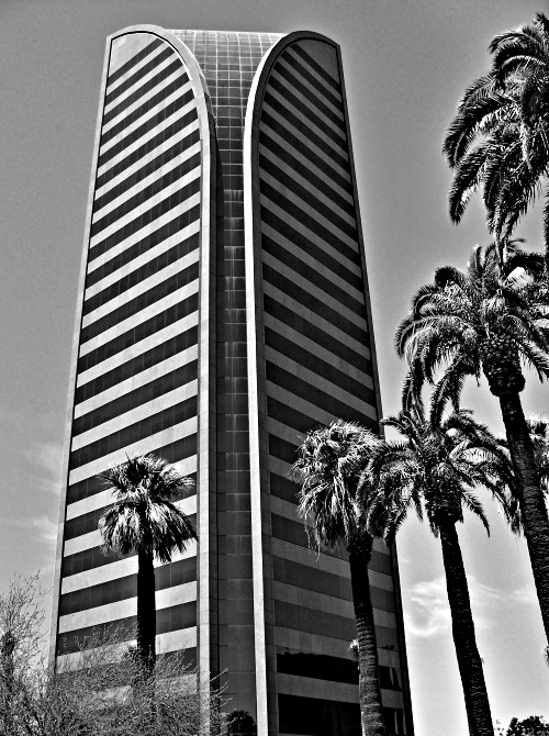
Wow - this is a good building for contrast, isn't it? Not sure about the trees though - they seem a bit unreal, from what I assume is the result of processing. Although, the trees as they are included in the composition is very engaging - the varying heights and how they continue past the frame (not seen whole) lend more visual interest to the shot.
Very cool. I like the graininess a lot. Has kind of a retro feeling even though building is quite modern. The haloing around the trees is little distracting.
I think the perspective is very nice. Great detail on the palms. Nice architectural photo. It does appear there is a halo effect around the trees and right side of the bldg. I've had this happen before if I mask the sky. What I've done to correct this is once I have the item masked(selected) I expand what I have selected by about 5 pixels (or as much as necessary), and then do the editing on the sky (or whatever you're editing) and this gets rid of that halo effect.
ahha !!! .. this certainly looks great in b&w ... the colour version taken from a different angle has other things to recommend it .. i like the line formed from the top of the palms to the one lower down in the image, it takes my eye right into the centre .. :)
what a visualy powerfull building, and choosing to include the palms was a good idea.
having the building in the centre of the image may have made it even stronger.
nick





 Add photograph to your favorites
 Add photographer to your favorites


 Photographer found comment helpful.


