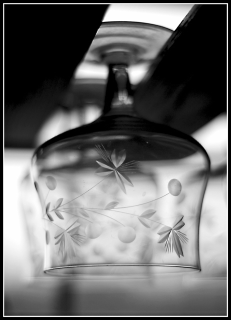
I like this idea, but I am thinking maybe a sharper angle to the side would really add to it. Also on the base there is a light spot.. looks over sharp? to me it really throws the dof off in a big way. I like the bell design being in focus, however, I think if the lip and design was in a sharp focus and the rest shallow this would really make much more of a statement. Also, a bit more balance on the image. Glass is really hard to photograph well. In this situation I would have tried to use dark material or boards on either side to create a nice outline on both sides of the glass.
This is SO pretty - at first from the thumb, I thought you were being quirky and displaying it upside down, now I see the holder and I think it's really beautiful presentation.
Oh how pretty! Talk about taking the ordinary and glamming it up to be extraordinary! The dreamy look gives the glass an etheeal look which is beautiful!
This is a nice, soft image, it goes with the delicate patterns of the glass. I might have tried for a slightly different angle so the black rail wasn't running through the glass.




 Add photograph to your favorites
 Add photographer to your favorites


 Photographer found comment helpful.


