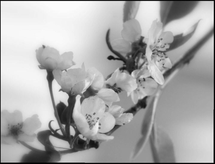
I think you have had some useful comments on this already (and soem less so). I would like to start with the positive - you have put together a lovely composition, I especially like the sense of depth and the curve of the lives from the top right towards the bottome left.
You have had a few comments to the effect that it is not sharp enough/too soft or out-of-focus. I note that you put in the soft focus (I suspect you did the same with yout triptych entry). The main problem to me seems to be that there is no clear focal point to really enage the viewer. I would love to see this image with just the front blossom in sharp focus and the rest as it is. With perhaps a slighty tighter crop on the left. Then the flow of the lines would lead the eye to the focal point. Maybe.
There are also a few comments on your choice to go for B&W. The tona contrast of the image certianly does look flat, but that doesn't mean going for B&W was a mistake. What method did you use to convert to B&W? I recommend first finding out which channel has the best contrast, and then using the channel mixer to convert to greyscale.
It is my hope that these insights are helpful and constructive. Please feel free to PM me if you have any questions regarding this critique. And please remember to mark it "Helpful" if you found it so. Good luck with future challenges.
I love the high-key of this, how almost everything is white (or almost white) but it's a little too soft-focused. A soft focus would be nice, but this is just too out of focus. Pretty shot though!
nowhere near sharp enough in my opinion and black and white does not do this justice. While B+W works well with some subjects I believe nature has been given colour for a reason and you should always make the most of it.
That said, I respect the fact you have tried to do something a little different, especially as this is a very popular subject.
I wonder what this looks like in color. Doing it in black & white is fine, except I like to see not only really bright white, but also, very dark areas too. There's a lot of gray colors. Maybe a bit more contrast and that would really make it "pop".






 Add photograph to your favorites
 Add photographer to your favorites

 Photographer found comment helpful.


