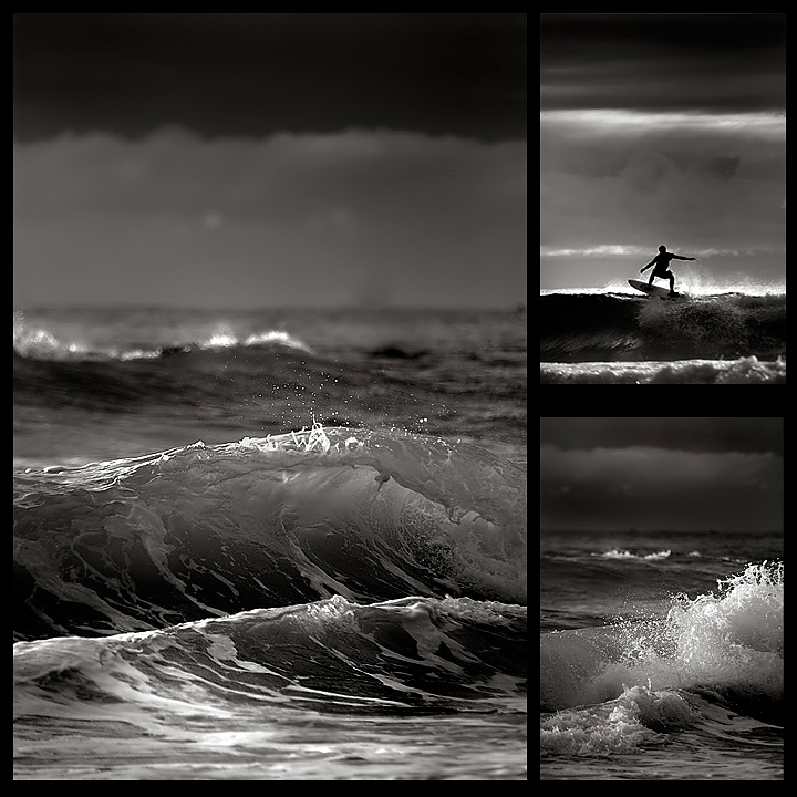
Based on the success of my tryptich image (at least on the first day) I thought I would enter another in the 'series'.
Just dodge and burn mainly with USM and noise reduction...some selective blurring.
PREDICTION: Not sure if this will get voted down because of the other tryptich, but I am hoping it will still do OK...high sixes?
POST: Well it was awesome to win the blue in the Triptych challenge, so I knew this wouldn't do as well. I actually am so blessed to finish 17th with nearly 600 images in this challenge. I have had a great run lately after a horror few months where I seemed to have lost my MOJO.
I love the bigger picture and I love the colour image. If you saw the originals, they were flat and greeny lifeless images, but some work in Photoshop made them come alive.
Here is a colour version after some Photoshop work and before it went to duotone:
Thanks again for all the votes and kind comments and the faves.
Statistics
Place: 17 out of 573 Avg (all users): 6.7901 Avg (commenters): 8.1176 Avg (participants): 6.6885 Avg (non-participants): 7.0000 Views since voting: 2024 Views during voting: 293 Votes: 181 Comments: 29 Favorites: 2 (view)
Go figure I pull you again. You would think I would be getting sick of seeing your images and then commenting on them. But alas, it is not so.
Obviously from the same trip as your triptych entry this one wasn't as strong. I loved the people in all of your triptych images where this one felt lacking that focus. The waves are cool and the one surfer is great, but following up your triptych with this one may have prevented this from scoring even higher - not that 6.7 is low by any means, but having a direct comparison so close together can be tough.
And this one I think the color version may have done you better. The colors in these three images seem to be a better balance than in your triptych series. I would have been very interested to see how the color version would fair.
And like your trip entry - great detail, especially on the water spray of the largest image, excellent conversion, and a very nice layout. Keep up the great work Enzo. It's always a pleasure viewing your images.
The waves look silky smooth and the lighting is fantastic. B&W here is a great choice. Add me to the "prefer your triptych" entry but still enjoy this one as well.
I think this is a lovely piece of work overall. The bottom right photo seems a little redundant but works better than trying to only incorporate three images in this. One of my higher picks for this challenge. Good luck.
I particularily like the transparency of the wave in the large image. I think each of these images would be quite beautiful by themselves, and they look great together. ~8
Each of the three frames is quite good in its own right, and my favorite is the largest one (It'd be even better if the wave were not clipped on the right-hand side; i.e. slightly wider angle of view). However, the triptych as a whole seems to lack coherence, in my opinion, as the photograph with the surfer, although loosely connected, does not quite share the theme of the other two. I don't know, maybe if the one with the surfer were the dominant frame, I might have gotten a different impression.
Trying to get two good scores out of one session eh? :P The lighting is great. I wish the surfer at the top didn't look too pixelated but I'm sure that's just due to the resizing.
Super photographs. I would like to have seen something different in the third pane instead of an additional breaking wave...like the guy walking along the beach after he's done surfing...or something. That would send this triptych into the stratosphere...IMHO.7
This is so cool and unique!!! I absolutely LOVE how you turned it to black and white - usually shots like this are in color. The tones are beautiful. THe details in the foam of the waves is just awesome... Excellent shots.





 Add photograph to your favorites
 Add photographer to your favorites


 Photographer found comment helpful.


