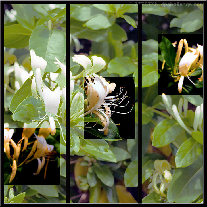
Made of one photo with marque tool, magic wand, multiple layers, contrast/brightness, saturation/desaturation, crosshatch filter, highlighted edges filter, foreground framing tool (PS Elements 4.0), and I think that's all. Just basic stuff used over & over & over until my brain is really tired.
Statistics
Place: 204 out of 244 Avg (all users): 5.2651 Avg (commenters): 5.1667 Avg (participants): 5.1250 Avg (non-participants): 5.3782 Views since voting: 795 Views during voting: 331 Votes: 215 Comments: 8 Favorites: 0
Overall, this is a very interesting effect you have achieved here. I like the little parts of bright color and I think it really helps to bring out the orange tones of the flowers. My first though was to go completely black and white in the background, but the more I think of that, the less I think I would like it. What I do think is distracting is that the shot emphasized in color on the left and right are not in focus. In a "regular" shot, this would not be an issue, the eyes would simply seek out that which was focused. Here, though, they drift to the colored parts, and 2/3 of them are out of focus, so it kind of takes away from the rest of the shot.
I think the shot is a bit busy, as well. Perhaps if you could have isolated the blooms a bit more without so much in the background it might have helped to define your subject a bit more clearly.
Again, I like the shot, and I was actually one of the higher voters on it. I think you had a great idea, and it could be a truly effective eye pleasing shot if just a couple of minor things were different.
If I need to clarify or explain myself further, please feel free to contact me.
I think this is too many boundaries. Maybe it'd work better without the vertical lines? I like the selectively edited sections and how they climb up to the right.
I really like this photo, but the description says that you can only use up to three images. Instead of giving it my instant 3 or 4 that I have given I gave it the actual score I feel it deserved minus one because it could just be an effect given to the image. While I like the honeysuckle photo, the smaller inside images make it look really busy. Plus other than the center one, the two side images have no particular drawing effect to them other than you highlighted them. Another reason is that I compare similar photos, flowers with flowers, cars with cars and so on when I vote and there is some increadable competition this time around. You have a really good eye. Please don't get too angry with my comment. :)





 Add photograph to your favorites
 Add photographer to your favorites

 Photographer found comment helpful.


