-Critique Club-
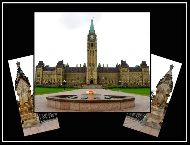
The first thing when I saw it was that I noticed that it wasn't using all of the available image space. Personally I think showing off the subject in larger detail, and having less background/frame, would have been nice. However, you did a *fantastic* job of having it be symmetric and balanced. The arrangement of the three images wouldn't have been my choice BUT you did it very very nicely. I also think voters probably appreciated seeing a non-traditional arrangement of images.
A blue sky would have helped this immensely. Something like that could be accomplished in Advanced editing and I think would have just set the mood a little bit better. Your colors and your contrast are very nice. I also like the white outer border as it matches the images nicely.
I think your presentation of the building was very competent but it did not impress me. Perhaps having a closeup or two for the additional side images would have drawn me in a bit more and caused me to have more interest in the subject. I will say that this is your weakest point - the lack of "wow factor". And I think your strongest point was a nice, crisp presentation of the images. |






 Add photograph to your favorites
 Add photographer to your favorites


 Photographer found comment helpful.


