Simple editing- slight adjustment to Saturation, Contrast and Shadow/Highlight.
I had to use my jpg files and limit the editing because I'm still away from home and the laptop is unpredictable about colors and refuses to accept the RAW from my D200.
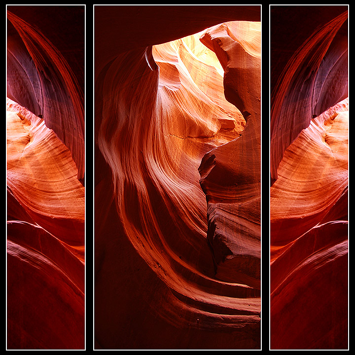
The canyon was fabulous.
Wow!!! Thanks everyone. I was wonderfully suprised to see this image score so high. It's a new PB and just a fraction from my year's goal for high score.
Cutter is right about the white stroke - lighter would have been much better.
I tried various other shots for the 3rd panel and none of them had the right swirls to create the wonderful movement from frame to frame. Some feel the outside panels should be reversed, thus framing the inner panel, so I'll try it. Still, I was looking for the continuation of the swirl and moving through the image. For me, this works.
Thanks again.
Statistics
Place: 5 out of 244 Avg (all users): 7.1441 Avg (commenters): 8.4375 Avg (participants): 6.9495 Avg (non-participants): 7.2923 Views since voting: 4991 Views during voting: 488 Votes: 229 Comments: 48 Favorites: 15 (view)
I gladly didn't not enter any of the slot, because I figured you would be keen on entering. I wonder, perhaps, if you used a lighter white interim border if it would have finished in ribbon position. Just a thought going forward....
Beautiful pictures and wonderful exposure. I like the crop, but not sure I like the use of the same image on the right and left, though I do like how you defied convention and had the curves going out of the frame ... my first reaction on seeing this was that the R & L sides should have been flipped to create an arch leading into the scene, but after looking at it some more i think you made the right choice. 8
Beautiful light and colour. I love how the 2nd and 3rd photos seem to flow into one another. The 1st photo doesn't do this and looks a bit out of place. Ah, just realized the 1st picture is a mirror image of the 3rd. Perhaps if you had used a different photo in that place.
What an amazing subject. I like how you've mirrored the left and right of the centre photo. Just one thing, the additional white on the border seems a bit harsh and is a new colour introduced to the photographs, which I think mildly detracts.
The images are great. I would have liked to see a difference on either side of the middle image, because they look as they are a reflection of each other.





 Add photograph to your favorites
 Add photographer to your favorites

 Photographer found comment helpful.


