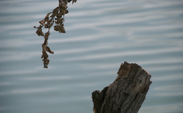
This shot "feels" symmetrical in that it is balanced and has two "opposites" that counter eachother, but it is not quite truly symmetrical enough to really wow the voters. I suppose one could say that you have a metaphorical symmetry going on here.
I like how the two elements balance eachother. It is almost a life into death kind of relationship being portrayed. I think compositionally, it could be cropped tighter on either end forcing more focus onto the branch and the trunk. I also like the watery background. That is nice.
Technically, the exposure may be just a touch under, because while I can still see some bark detail, I had to look really hard. Maybe a slight slower shutter speed would have helped that.
Overall, not a bad shot, but it doesn't fit the challenge real well, and those tend to not do well in the challenges.
If I need to further clarify or explain myself, please let me know.
No real symmetry here compared to what others have submitted. Would have been more fitted for submissions in the Rule of thirds challenge. The colors are a bit dull. Maybe you could try covnerting to B&W and play with the channels to give it a bit more depth and contrast. Not a bad shot - just needs a bit of work IMO.
I love the composition. The opposition of the lines of wood and water accentuate the differences in colour and texture.
To bring that out even more, I'd try boosting the saturation a little on the red channel to give the wood a bit richer shade, and tweaking the levels a touch. Raising the midrange a bit would allow a little more contrast while still showing lovely detail in the textures.
I wouldn't want to see any dramatic changes though... it's a lovely, peaceful shot :)
I like the take on symmetry here, though the lighting is not particularly pleasing on the whole, either for the branches or the water. Better lighting would have improved this, but I do like it as is, as well.





 Add photograph to your favorites
 Add photographer to your favorites


