Triptych throws up so many different ideas and styles.
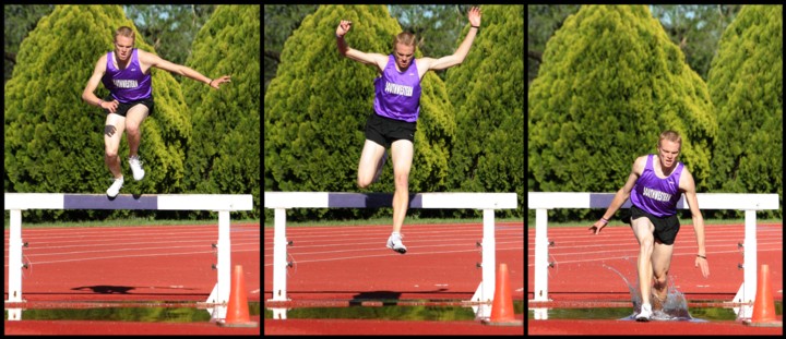
Composition is nicely balanced and the clincher for me is the last shot of the three where his foot hits the water. There are a couple of issues that I will touch on in the technical section, but a good attempt for a Triptych.
Technically, I feel the overall group of shots lacked that final sharpness to make them jump out of the photos. Bringing the hurdler closer and using a shallower DOF would have blurred the background. As one commenter stated, it has the feel of a film strip, one way over this would have been to use thicker borders.
Overal conclusions, I like the stop action feel and with wider borders and sharpening a little more would have given this real WOW factor. Now that voting has finished, you might consider using the original to try some PP, experiment with different borders, saturation and sharpness. A good entry and due to the minor issues, I think it finished in about the right place in the challenge. Be sure to post any modifications you do to it. Well done.
Something about this makes it look like the man is in front of a green screen. He just seems to stand out too much. Maybe he's too bright? I don't know for sure. He just looks a bit out of place or like he was photoshopped into the picture.
I'm probably not much help. I don't know quite what it is. It could just be my bad eyesight.
Great work in capturing a fast-motion image without reduction of quality, though. I don't see one bit of blur on the bodyparts.
=)
That was always a fun race to watch when my kids were on the track team. Shots look a little overexposed but I like the sequence; hope he wasn't hurt as his landing looks a bit awkward!
I think a larger aperature would have made this better. The background is distracting. You may have also been able to get him in sharper focus too. IMHO






 Add photograph to your favorites
 Add photographer to your favorites

 Photographer found comment helpful.


